

Project Overview
The Product
The Parent-teacher app (the real name is hidden for privacy reasons) allows parents and guardians to connect with their child’s teachers and caregivers by sending daily reports, multimedia SEL playlists, engaging activities, and two-way messaging.
The app has over 100k+ downloads with a 2.2-star rating on iOS and 2.3 on Android.
The app has over 100k+ downloads with a 2.2-star rating on iOS and 2.3 on Android.
Project Time
January 14 - 29, 2023
My Role
UX/ UI Designer
Responsibilities
Research, Personas, User flow, User Journey, Wireframing, Interaction design, Prototyping, Usability Study
Tools
Figma, FigJam, Adobe Photoshop
The Problem
Parents and caregivers find it challenging to use the app to enter data and communicate with teachers.
The Goal
The goal of the redesign is to help users easier access information about their kids and to shorten the time of entering data.
We will measure effectiveness by the time the task requires: the error rate and user’s subjective satisfaction.
We will measure effectiveness by the time the task requires: the error rate and user’s subjective satisfaction.
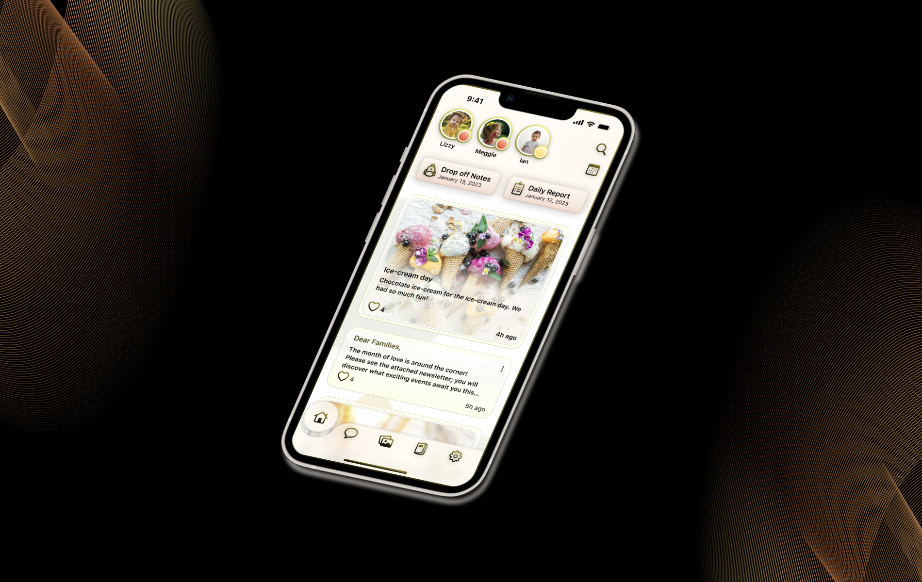
News Feed after the redesign
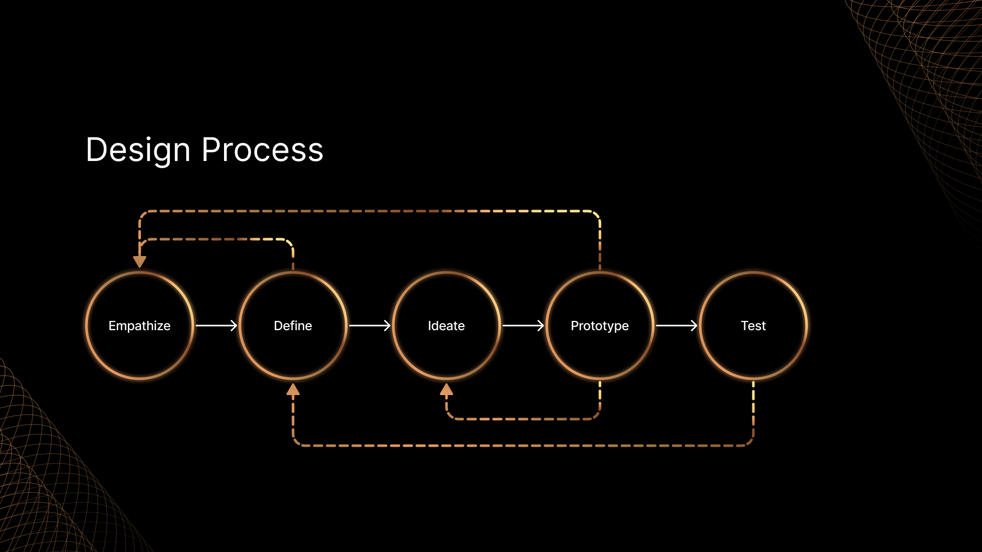
Empathize
To get a better grip on the project, I conducted secondary research and analyzed the user group, their priorities and goals, and what pain points they had.
To get a better grip on the project, I conducted secondary research and analyzed the user group, their priorities and goals, and what pain points they had.
To know the needs of the parents and preschools who use similar apps daily, I conducted secondary research first. I read articles about parenting a preschooler, communication between parents and preschools, and what functionality is essential for successful communication.
I joined parental groups on Facebook and searched for posts and comments to know firsthand experience. Also, I collected the reviews on the app and its competitors for both platforms and conducted a competitor analysis.
All that gave me big-picture information to understand the field and the pain points parents and caregivers might have. With the gained experience, I went into primary research.
Primary Research
The primary research I started with an in-depth analysis of the app to understand functions, overall architecture, and navigation. Through the research, I identified some usability issues and pain points (buttons, labeling, drop-off notes, and home screen page). I will validate them in the Usability Study.
Understanding the user
- User Research
- Affinity diagram
- Personas
- Problem statement
- User Journey maps
- Affinity diagram
- Personas
- Problem statement
- User Journey maps
Health screening after the redesign.
Affinity Diagram
To understand the user, I collected reviews on the Parent-Teacher Communication App from the Google Play and App Store, wrote down the pain points on sticky notes in FigJam, and sorted them to determine the tendencies.
According to the research, most respondents had an unsatisfactory overall experience. Most users complain about the messaging system, inability to get real-time notifications, lack of reminders that kids need something, and problems with viewing photos.
After digging deeper into research, I discovered that the app has a built-in messaging feature, but some childcare centers switch it off.
Real-time notifications are another highly demanded feature that causes a lot of questions. According to the review of one of the center directors (who is also a mom that uses this app), some childcare centers prefer not to send real-time notifications about kids because it distracts caregivers from their primary responsibilities - to take care of the kids. And when it takes too long for them to input data, it causes anxiety to some parents. That’s why the necessity of this feature is controversial.
Some of the problems (like photo downloading and zooming) were fixed in the latest update. But the new version caused a new flood of negative reviews on the UI. Reviewers complained that:
- The navigation is complicated and non-intuitive.
- The welcome screen contains some generic articles that are not in any way related to the kid.
- It is hard to write Drop-off Notes or input health screening.
- There is no Submit/Apply button.
- Mark as Absent button causes a lot of confusion (users click on it without reading, thinking that it will confirm the entered data, but instead, are transferred to the screen where they need to enter the reasons of absence).
- Once the child has been checked in, or an absence was submitted, parents can’t edit any information or add a new note to the teacher.
- Parents of multiple kids have a problem toggling between kids, difficulty entering the pick-up times, and a necessity to see pictures of all their kids in the same Memories feed Infants’ parents are concerned that they can’t appoint what food is intended for what meal, and the app doesn’t allow them to see the baby’s activities chronologically.
Most responders noted that though the updated app is much more convenient, there is still much room for redesign opportunities to make it more intuitive and accessible.

The Affinity diagram is based on the App Store and Google Play reviews. The reviews were sorted into categories and then prioritized to determine the next steps of design.
User research: summary
I conducted a Usability Study of the app to see how participants interact with the product, and created Empathy Maps to analyze how they feel and think during the study, to identify the user’s pain points, and to confirm or deny my assumptions.
A primary user identified through the research is a preschooler's parent who needs to fill in information about his child's health daily to check him in a preschool and to monitor his activities throughout the day.
The user group confirmed the initial assumptions about the App's users. The research also revealed that some parents use the app for 2 or more kids and have difficulty toggling between children during the drop-off and while viewing the memories.

Empathy Map

User research: pain points
User Persona: Linda
Based on the information I gained during the User Research, I created an aggregated User Persona.
So, meet Linda. She is a 35-year-old working mother of 2 kids who tries to balance her work and family life. Before dropping off her 4yo son in a childcare center, she needs to complete a Health Screening so that her son can attend the classes.
She is very passionate about her kids. When she picks her son up, she meticulously examines his Daily reports to know how he spent his day.

User Persona: Linda
User journey map
I created a user journey map to track how my persona feels when her son is at a preschool:

User journey map
Define
Problem Statement
Linda is a parent who needs an easy-to-use app to interact with her son’s preschool because the app she currently uses is not intuitive and hard to use.
Ideate
Competitive analysis
This niche of teacher-parent communication apps is very busy and highly competitive. According to the analysis, the most popular direct competitor is Brightwheel: Preschool & Child. It has more than a million downloads on both platforms, with an average rating of 4.9. The app has an intuitive design, sign-in/out, messaging, learning assessments, daily sheet reports, photos, videos, calendars, online bill pay for parents, and more. The app's main advantage is good customer service and an effective support team.
Another popular competitor is Bloomz. It also has 1+ M downloads with a rating of 4.6 on iOS and 4.6 on Android. With Bloomz, parents can be notified via SMS/TEXT messaging, read posts in their preferred language with one-click translations (80 languages available), and communicate with other parents for play dates, carpooling, etc. The majority of negative reviews complained about its bugs and not intuitive UI.
One more competitor with more than a million downloads is ParentSquar. It has 4.6 stars in Google Play and App Store. The app allows parents to view posts, appreciate and comment, sign up for wish list items, volunteer, RSVP, view the sign-ups, check dates for upcoming school and class events and add them to their device calendar, send private messages (with attachments) to staff members (or other ParentSquare users*), participate in group conversations, purchase for goods and services offered for sale by the school. The major problem the app currently has (according to reviews on both platforms) is an issue with the app's push notifications.
I also reviewed competitors such as Klassy, HiMama: Daycare Management App, Parent Class 123, Skool Loop, Smartcare for parents, and My Bright Day (the apps are sorted by the number of downloads and their rating).
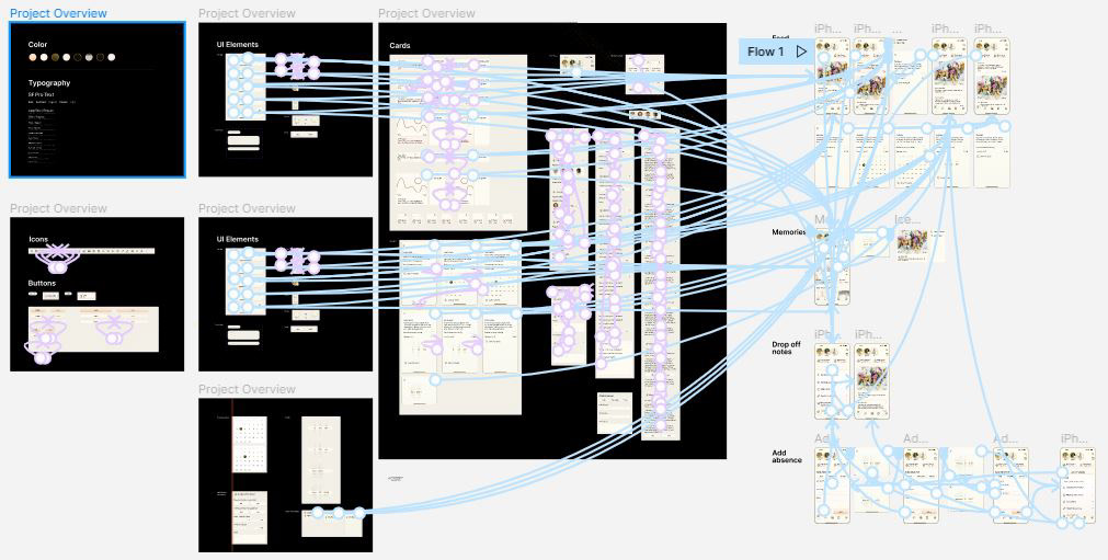
User flow
After analyzing how users interacted with the original app, I redesigned the User flow using the insights I gained during the Interviews and the Affinity Diagram, showing how the Persona would interact with the redesigned app.
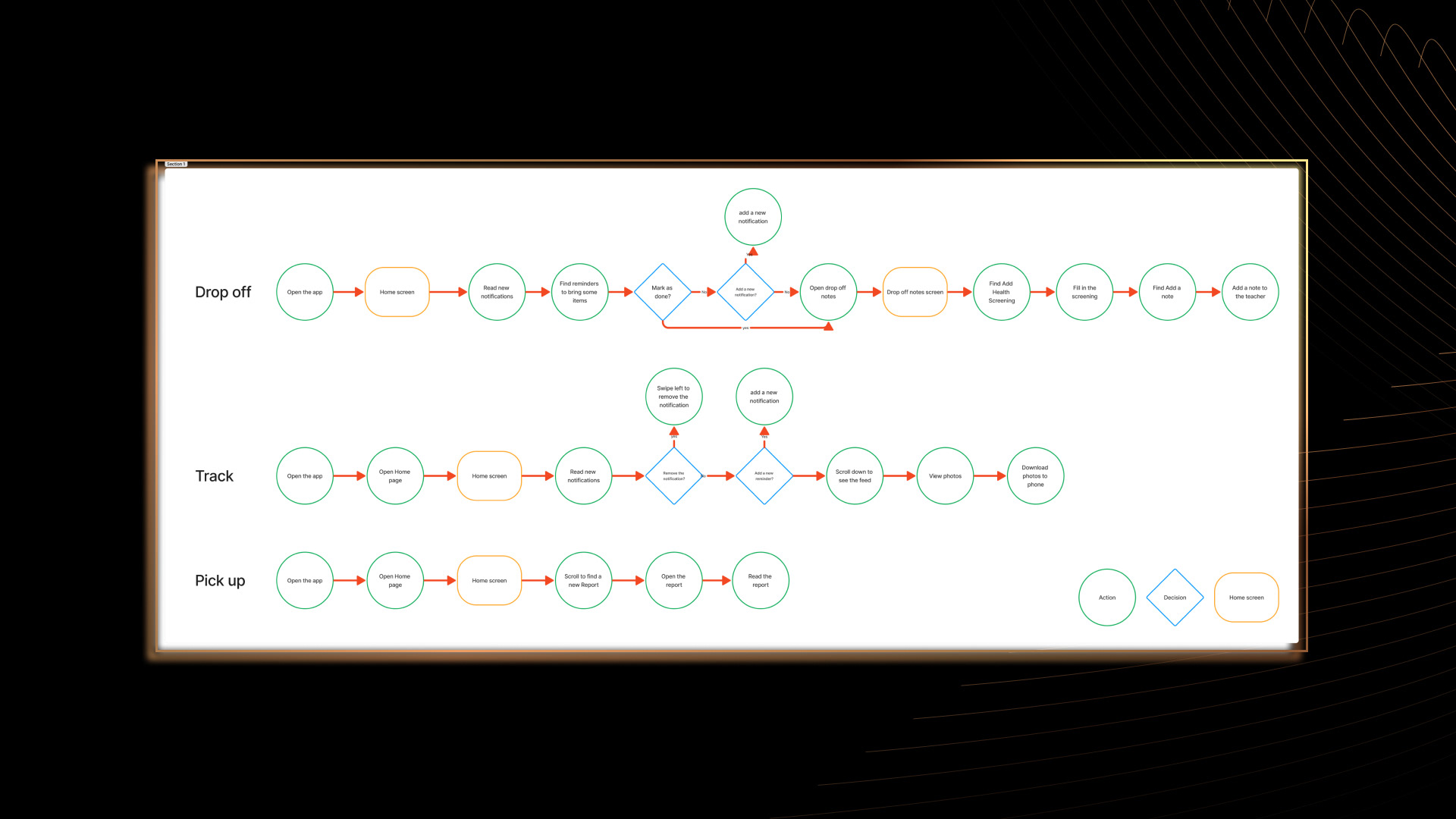
User Flow
Prototype
- Paper wireframes
- Digital wireframes
- Low-fidelity prototype
- Usability study
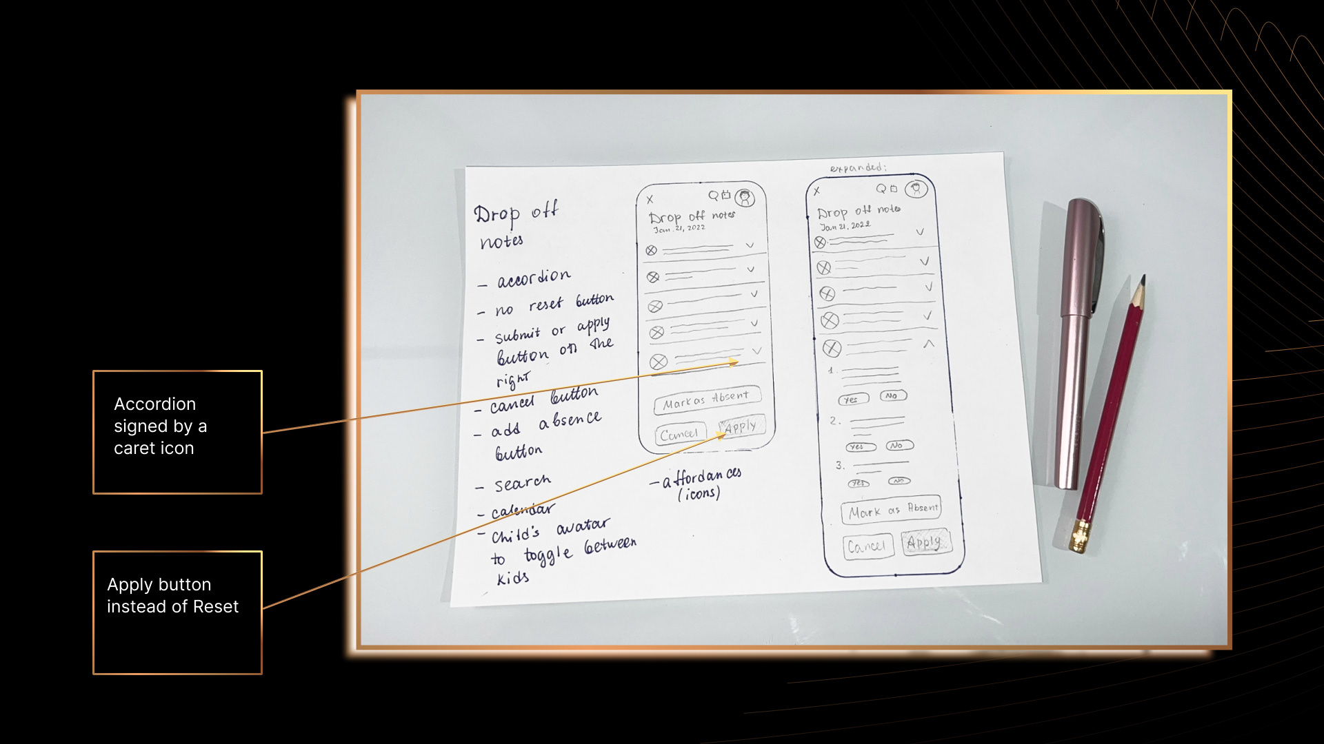
Paper wireframes
To kick off the design phase of this project, I created multiple low-fidelity paper wireframes to figure out the layout and content that needed to be included on each page.
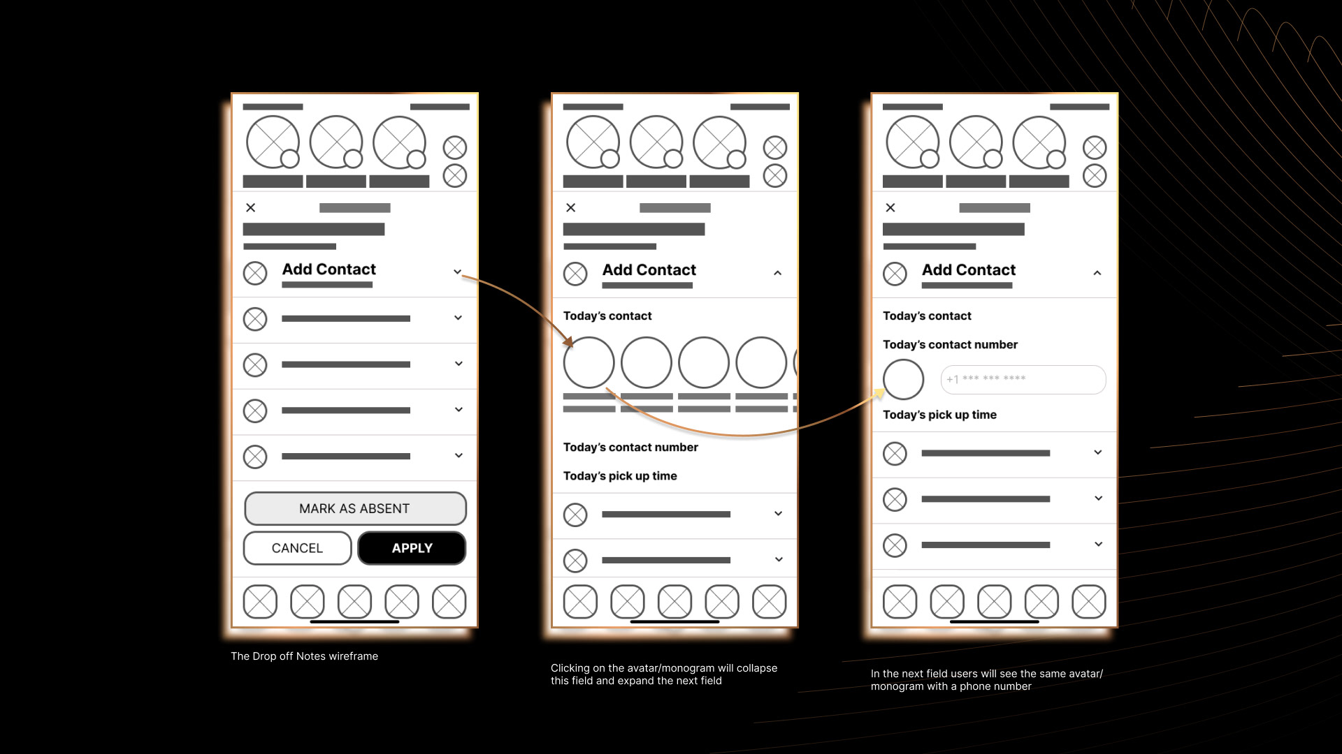
Most of the participants considered it to be challenging to enter Drop off information. That’s why for the Drop-off Notes I decided to use an accordion signed by a caret icon. After the expansion, the caret twists. Accordion collapses the content and makes the page more manageable without the need to visit a different page. It allows users to focus on the content most relevant to the task.
Another common complaint was caused by accidentally clicking the Reset button on the right side at the end of the Health Screening page, and I replaced it with the Apply button. If a user wants to dismiss the changes, he can still click on the X or Cancel buttons.
After several rounds of sketching, I transitioned into digital wireframes.
Based on the user research, I created multiple variants of layouts to figure out the layout and content that need to be included on each page.
Digital Wireframes
One of the pain points was a not informative Home Screen of an app containing some unrelated generic articles.
I decided to design it as a newsfeed that will show new announcements, photos, and daily reports in chronological order. All the posts can be liked and added to favorites (they can view them later on the Memories screen).
If a new notification contains some vital information, they can pin it by swiping left, and it will reveal the Remind, Pin, and Delete buttons.
I also added small indicators on the bottom right of the kids’ profiles; they will denote that the feed has been updated.
Parents with multiple kids in the same preschool can view either individual feeds for every kid or combine all the feeds in one by clicking on avatars.
I also reconsidered the placement of Avatars, Drop Off Notes, and Daily Report buttons, added Search and Calendar icons, and designed contextual swiping for new notifications.
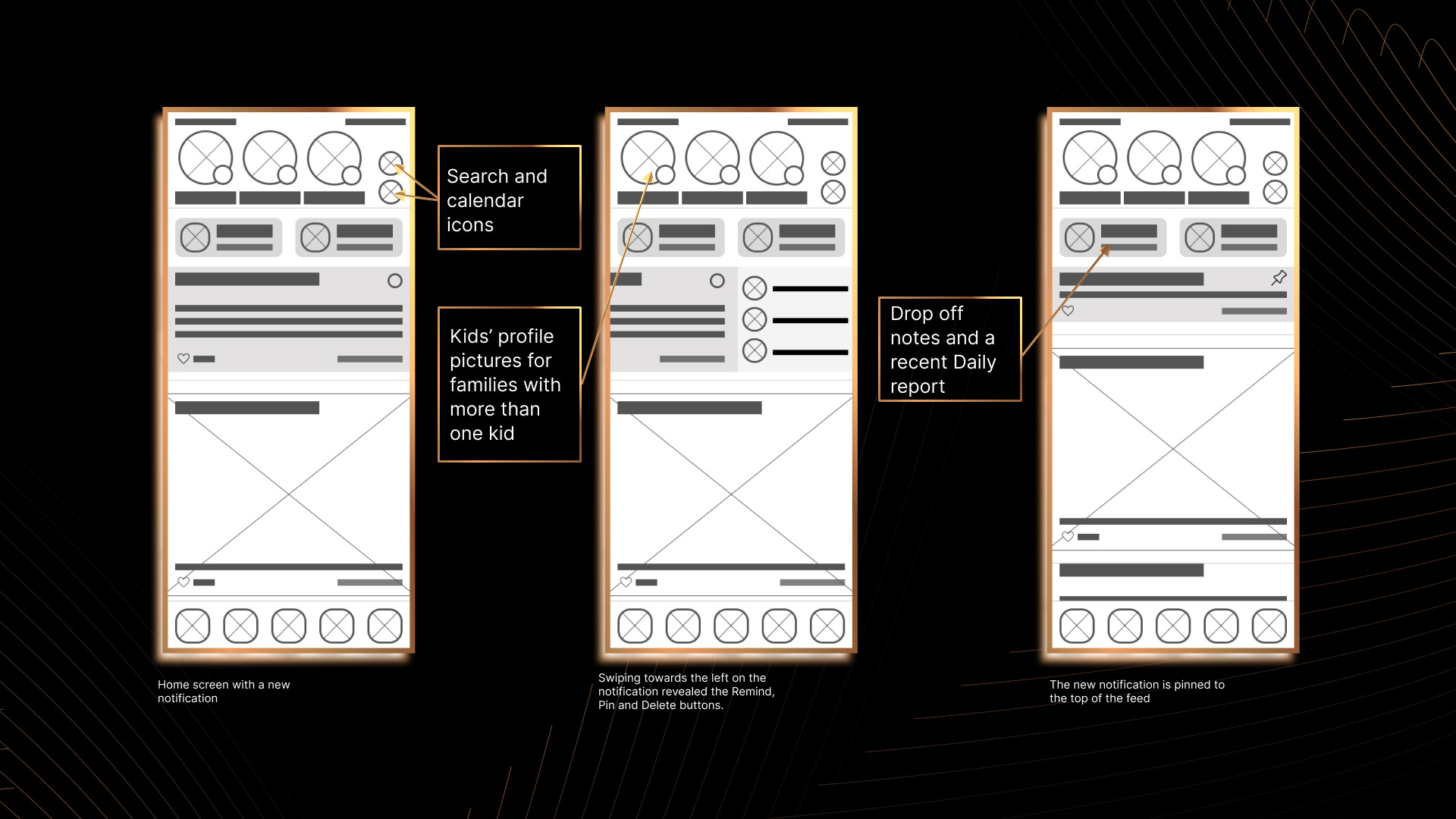
The redesigned Home screen has a news feed where users can view new announcements, photos, or daily reports from the teachers.
Memories Screen
I preserved the original design for the Memories screen, but with a few tweaks and twists:
- the content is prioritized and redistributed to eliminate some visible chrome
- new notifications are marked by a different color
- important information can be pinned at the top
- new notifications are marked by a different color
- important information can be pinned at the top

Memories screen redesign
Drop off Notes
I used an accordion to decrease the amount of time users spend while filling in the Drop off Notes. It allows seeing the entire workflow without being overwhelmed by a long form.
As long as users often unintentionally clicked on the Mark as Absent button without reading (because there was no other button below the form), I added an option to click on the Apply button to confirm their choices or Cancel to dismiss the entry and bring them back to their previous screen.
As long as users often unintentionally clicked on the Mark as Absent button without reading (because there was no other button below the form), I added an option to click on the Apply button to confirm their choices or Cancel to dismiss the entry and bring them back to their previous screen.
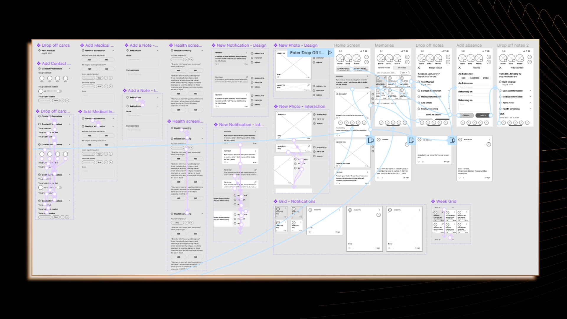
Low-fidelity prototype
The User flow connects the Home screen, Memories, Drop off Notes and Add Absence screens. Users can expand or collapse Drop-off information, swipe left to open to reveal additional functions and view photos and posts in full size.
Test
Usability study
I conducted remotely moderated usability studies with my supervision to validate my design decisions. Methodology: each session took 5-7 minutes, based on a list of prompts.
Research goals:
- Determine if the app is easy to use
- Identify obstacles that users might have
Research questions:
- Identify obstacles that users might have
Research questions:
- What insights can we gain from user flows?
- How long does it take the user to enter Drop-off information? Are users able to successfully enter Drop-off information?
- How long does it take the user to mark a child as absent? Are users able to successfully Mark a child as absent?
- How easy or hard for the user to successfully pin the announcement?
Refining the Design
High Fidelity Prototype
I've created a high-fidelity prototype that allows users to view the news feed that contains new photos from the childcare center, review announcements, make reminders of important events, and pin important posts.
I also removed the Reset button and decreased the amount of time users spent entering data.
Conclusion
At this point, I finished the first iteration of the design process.
During the Empathize stage, I created an Affinity Diagram to analyze reviews on the app. Then I conducted five interviews and filled in Empathy maps. After that, I started an aggregated Persona based on the information I gained. I also made a User Journey map to see how the Persona feels when her son is at a preschool.
Afterward, I proceeded to the Define stage, where I defined the Problem statement.
At the Ideate stage, I conducted a Competitive Analysis for direct and indirect competitors, sorting them by the number of downloads and their ratings. I assessed their strengths and weaknesses in terms of user experience, functionality, and overall experience to identify improvement opportunities to gain a competitive advantage in the market.
I also created a User flow showing how the Persona would interact with the redesigned app.
At the Prototype stage, I created multiple low-fidelity paper wireframes, then transitioned them into digital wireframes and created a low-fidelity prototype.
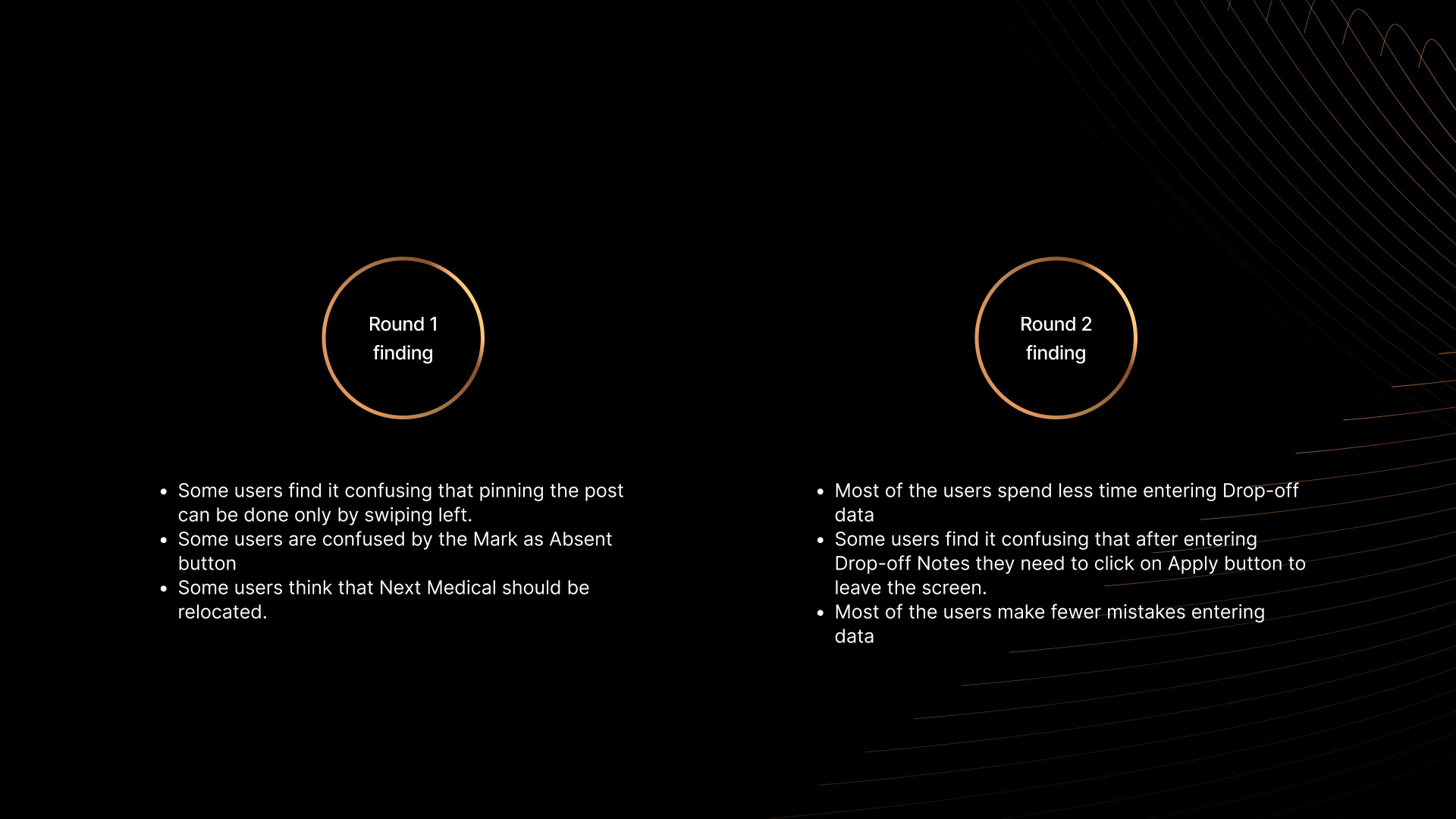
To test the prototype, I conducted two rounds of moderated usability studies. Based on my findings, I updated the design and built a High-fidelity prototype.
Next steps
- Perform a usability study of a refined design
- Consider accessibility to improve user experience
- Create a user flow for the second persona (for a parent of multiple kids who needs to toggle between kids to enter Drop-off information and view the Feed)
- Consider accessibility to improve user experience
- Create a user flow for the second persona (for a parent of multiple kids who needs to toggle between kids to enter Drop-off information and view the Feed)
"Remind me later" feature.
Let’s Connect
If you have any feedback or want to chat with me, drop me a message at my Contact page.
Thank you!