Project Overview
Project Background
Rutgers University is looking for a user-centered solution to facilitate an inclusive and supportive sense of community through the exploration of AI technologies that can augment and build on this community.
Problem
How can AI automation optimize the Rutgers University experience while reducing the bottom-line costs to provide a valued education?
Goal
To create a user-centered mobile app that will facilitate an inclusive and supportive sense of community for Rutgers students utilizing AI technologies.
Timeline
2 weeks
Tools
Figma, Adobe XD, Adobe Photoshop
RuBuddy Team
Julie Pavlova, Jonny Lin, Dipendra Kayastha, Phaneendra Sivangula
My Role
Product designer: Intreviews, Personas, Ideation, High-Fidelity Prototyping, Heuristic Evaluation, Usability Study, Visual Design.
Throughout the project, I worked in a cross-functional team with a User Experience Designer, an Engineer, and a Product Designer.
Design Thinking Process
Understanding the User
User Research
The Qualitative research was conducted in the form of contextual interviews performed at the Cook/Douglass campus.
We interviewed 25+ commuting Rutgers students.
One researcher performed as a facilitator, and the second one was a note keeper. We exchanged roles in turns and asked additional questions when it was needed
The goal of the Research
- To gain a deep understanding of students' needs, pain points and define the opportunities for app development.
Affinity Diagrams
We gathered the interview insights on sticky notes and grouped them in meaningful clusters.
Distilling from research, we identified trends and patterns, made groupings based on them, and then created three different personas.
All the Personas were analyzed based on their demographics, interests, experience with AI technologies, needs, and frustrations:
- Alex: 18, a transfer student from the University of Delaware. He lives in dorms and misses his family and friends who live in his hometown. He enjoys playing video games between classes.
- Antony: 26, works in retail and wants to become a product designer after graduation. It usually takes him about a 40-minute drive to get to Rutgers, so he prefers to take mostly online classes. He enjoys football games and hanging out with his friends.
- Jess: 20, has been working as an assistant at Rutgers since her first year. She enjoys her work and loves hanging out with her coworkers. She never turns down a good sushi spot and loves attending music concerts.
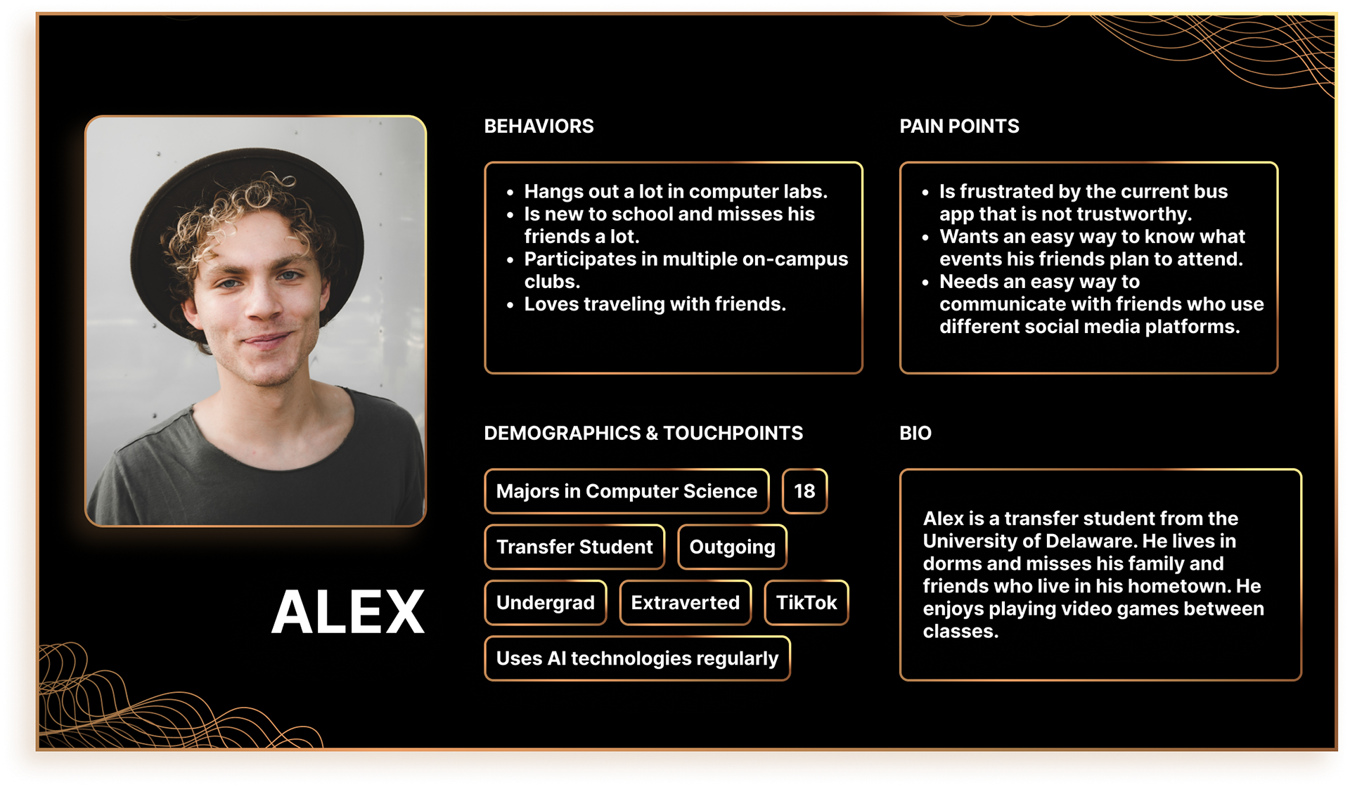
Alex is a transfer student from the University of Delaware. He lives in dorms and misses his family and friends who live in his hometown. He enjoys playing video games between classes.
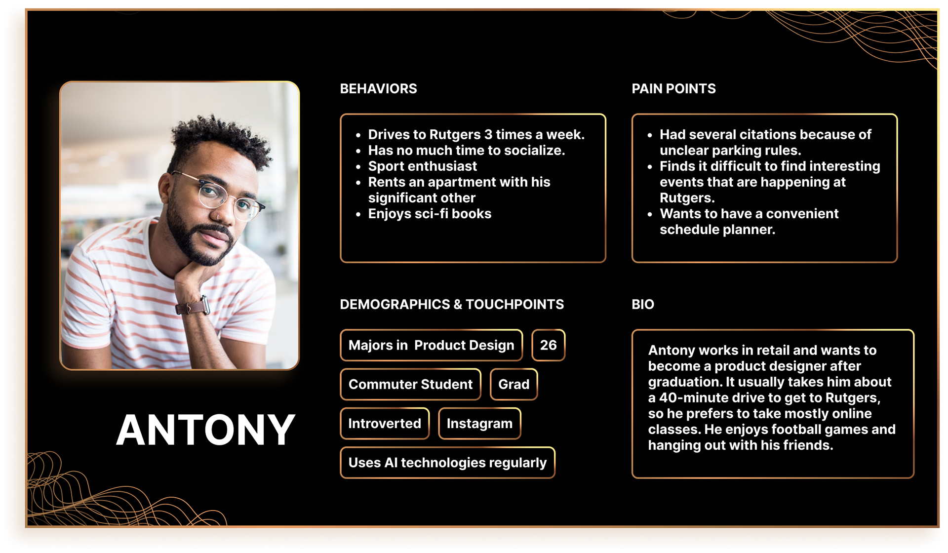
Antony works in retail and wants to become a product designer after graduation. It usually takes him about a 40-minute drive to get to Rutgers, so he prefers to take mostly online classes. He enjoys football games and hanging out with his friends.
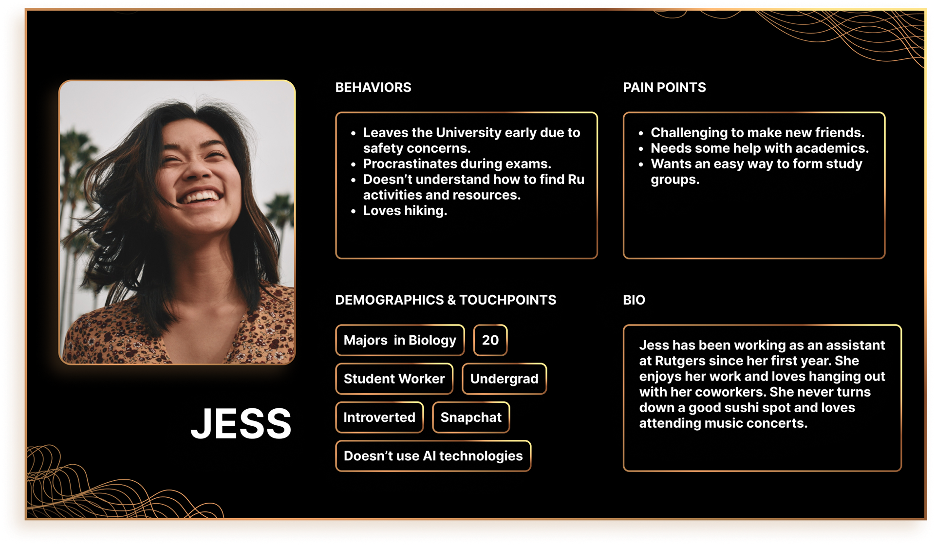
Jess has been working as an assistant at Rutgers since her first year. She enjoys her work and loves hanging out with her coworkers. She never turns down a good sushi spot and loves attending music concerts.
Proto-Persona
We prioritized those groups and created one Proto-Persona.
Meet Mike Montello, a 22-year-old undergraduate student majoring in Computer Science. He is an introvert but likes to meet with his friends. He is interested in getting involved in College events/activities and likes to do assignments in study groups. He is open to AI technologies, uses social media to connect with friends, and likes to spend some time alone reading a book or watching a good movie.
Some of his challenges are time management, schedule planning, struggle to find resources, need for personalized support, and difficulty in finding parking spots for students.
User Journey Map
The current-state journey Map for Mike shows a day in his life, all his actions, thoughts, feelings, and opportunities. The Journey map depicts his morning routine at home, during his commute to University, during his studies at Rutgers, and after he gets back home:
Design Studio
The Design Studio is an ideation exercise to generate numerous ideas and solutions for a given problem. We used multiple techniques to generate ideas, sketched them on paper, presented them to our teammates, and then had critique sessions.
How Might We
For the How Might We exercise, we used a “Crazy 8” approach. Every member folded pieces of paper to have a grid with 8 spaces. We used the 6-8-5 rule: 6-8 sketches on an 8-piece grid in 5 minutes.
Some of our How Might We’s:
- Create an AI-powered app to facilitate a supportive community by helping students to solve their academic issues?
- Foster an inclusive environment by helping students participate and organize study groups?
- Find a solution for an easier process of finding parking spots?
- Facilitate an inclusive environment by creating an app that can help students be informed about the events that are happening at Rutgers.
User Storyboard
When the team was unified on the ideas we wanted to implement, we transitioned to creating User Storyboards, using a similar technique by making sketches on how users might interact with our app.
This exercise gave us a clearer picture of what we should build.
During the critique sessions, we analyzed the merits of the proposed solutions and how and/or why this design does or doesn’t satisfy the persona’s goals and needs.
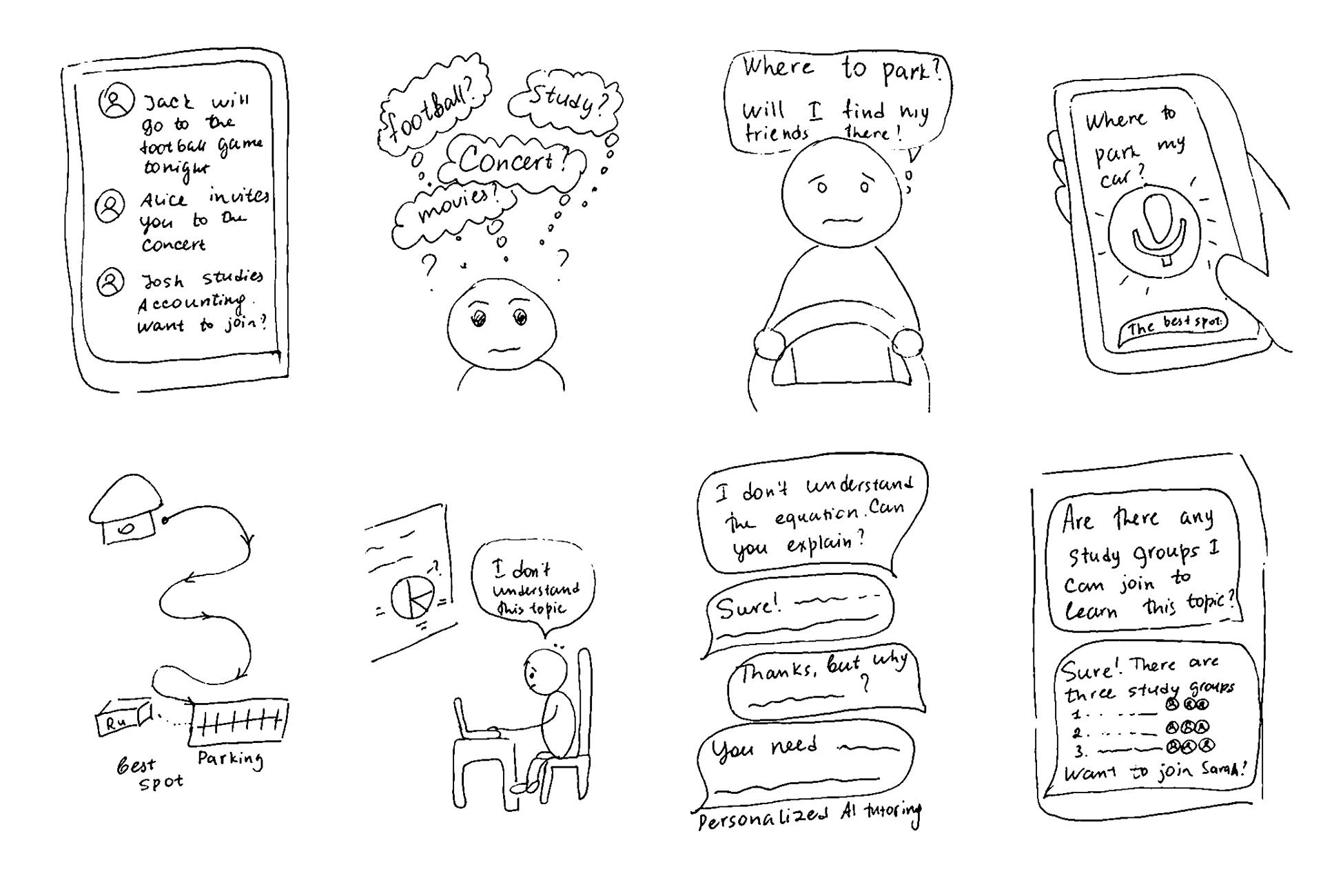
The storyboard I created for the Design Studio: 1-2: Mike scrolls through the app's feed to catch up on his friends' plans for the evening. "Should I go to the football game with Jack, or join Alice at the rock concert she's been dreaming about for a long time? I need to study Accounting first; I have a quiz tomorrow. Jack is currently studying for the class. Maybe I should join him before meeting with friends." 3-5: Mike is en route to Rutgers and is worried about finding a parking spot near the building. He uses the app to seek suggestions and it recommends the best parking options for students nearby. 6-7: Mike is attending a Calculus class and requires assistance with a particular topic. He asks the app to explain the equation. The app guides him step-by-step through the process of solving it. 8: Mike inquires about any available study groups related to the topic. The app suggests three study groups, one of which includes Mike's friend Sarah. It recommends joining this group over the other two.
Each team member sketched at least one storyboard. Below is the storyboard I created for the Design Studio:
1-2: Mike scrolls through the app's feed to catch up on his friends' plans for the evening.
"Should I go to the football game with Jack, or join Alice at the rock concert she's been dreaming about for a long time? I need to study Accounting first; I have a quiz tomorrow. Jack is currently studying for the class. Maybe I should join him before meeting with friends."
3-5: Mike is en route to Rutgers and is worried about finding a parking spot near the building. He uses the app to seek suggestions and it recommends the best parking options for students nearby.
6-7: Mike is attending a Calculus class and requires assistance with a particular topic. He asks the app to explain the equation. The app guides him step-by-step through the process of solving it.
8: Mike inquires about any available study groups related to the topic. The app suggests three study groups, one of which includes Mike's friend Sarah. It recommends joining this group over the other two.
Paper Wireframes
After working on the User Storyboards, we had a better understanding of how we could better meet our persona’s needs. Creating Paper Wireframes was a quick and easy way to sketch our vision of the app functionality and to share our vision with the team.
Every team member created 8 different paper wireframes for the persona in 5 minutes, and then we had a presentation and critique session. It was interesting to see similar concepts but from a different perspective.
When every member had a chance to present their wireframes and get feedback from each other, a uniform concept of what we should design already materialized in our minds. We combined all these ideas into one cohesive user flow and transitioned to creating digital wireframes.
Digital Wireframes
The initial flow has the following possibilities:
- To get notified about the events nearby;
- To access the main page that contained events, study groups, schedules, and the possibility to personalize the app based on user preferences;
- To view the event pages;
- To create and join study groups;
- To communicate with other group members;
- To get personalized help from an AI chatbot, etc.
Below are some of the wireframes we created:
Event Notification Page
According to the qualitative research we conducted earlier, the majority of interview participants wanted to get notifications on the events that are currently taking place or will be held soon at Rutgers. They were complaining that there were a lot of things that were going on, but they either missed important notifications or got too many notifications about the vents that they were not really interested in. We tried to solve this problem by personalizing the event notifications based on users’s preferences.
Another insight was that 75% of students made their decision on whether to go to an event or skip it by checking if any of their friends would also attend these events. We decided to explicitly show who was planning to attend by placing friends’ avatars below the description of an event. Students can easily RSVP by clicking on the Join button or dismiss the notification by swiping up.
User Profile Page
The majority of interviewees said that it would be convenient if they had a university app that could adapt to their needs and create personalized suggestions. In the initial stage of wireframing, we wanted to personalize students' experience by allowing them to select the topics that they find interesting by tapping on the chips, similar to the process of customization of a Medium account after a first sign-up.
However, this idea was simplified and gamified after the first round of usability testing.
Scheduling. 60% of respondents mentioned that they had difficulty navigating multiple apps at the same time and were looking for a solution to manage their academic and personal schedules in one app. For that reason, we placed the schedule on the profile page below the interests section.
Refining the Design
Middle-Fidelity Prototype and Mockups
After numerous iterations, we transitioned to mid-fidelity prototyping.
In the illustration on the right, you can see the top-level destinations users can get by clicking on the buttons on the Bottom Navigation Bar. These are Home, Events, Study, and Search (Scarlet AI).
The Home page contains the events that are currently held at Rutgers, shortcuts to study groups, and a schedule. The Events page has links to popular events that might be interesting to a user, events that are happening today/this week/this month, as well as events that the user wants to attend.
Top-level destinations of the Bottom Navigation bar
The Scarlet AI is an AI-powered chatbot that:
- Helps students with academic questions;
- Allows users to find files, forms, books, or any other materials;
- Suggests study groups to join based on questions students have;
- Recommends parking spots that are permitted for students;
- Answers any parking-related questions including permits, citations, etc.
- Allows users to find files, forms, books, or any other materials;
- Suggests study groups to join based on questions students have;
- Recommends parking spots that are permitted for students;
- Answers any parking-related questions including permits, citations, etc.
Scarlet AI chatbot usage examples
Usability Study
During the moderated in-person usability study, we interviewed 4 Rutgers student participants, 18-25 years old. Participants were asked to perform tasks in a mid-fidelity prototype regarding the four user flows we created.
Goal
The goal of the research was to improve the usability of the application and find the weaknesses, strengths, and opportunities for improvements.
The Process
For every interview, we had one facilitator and one note-keeper. The duration of the interviews was approximately 12-15 minutes per participant. It started with welcoming a participant, establishing a rapport, explaining goals and ground rules, getting informed consent to take audio/video, performing the tasks, asking follow-up questions, and gratitude for participation in the interview.
Results of the Usability Study
Opportunities
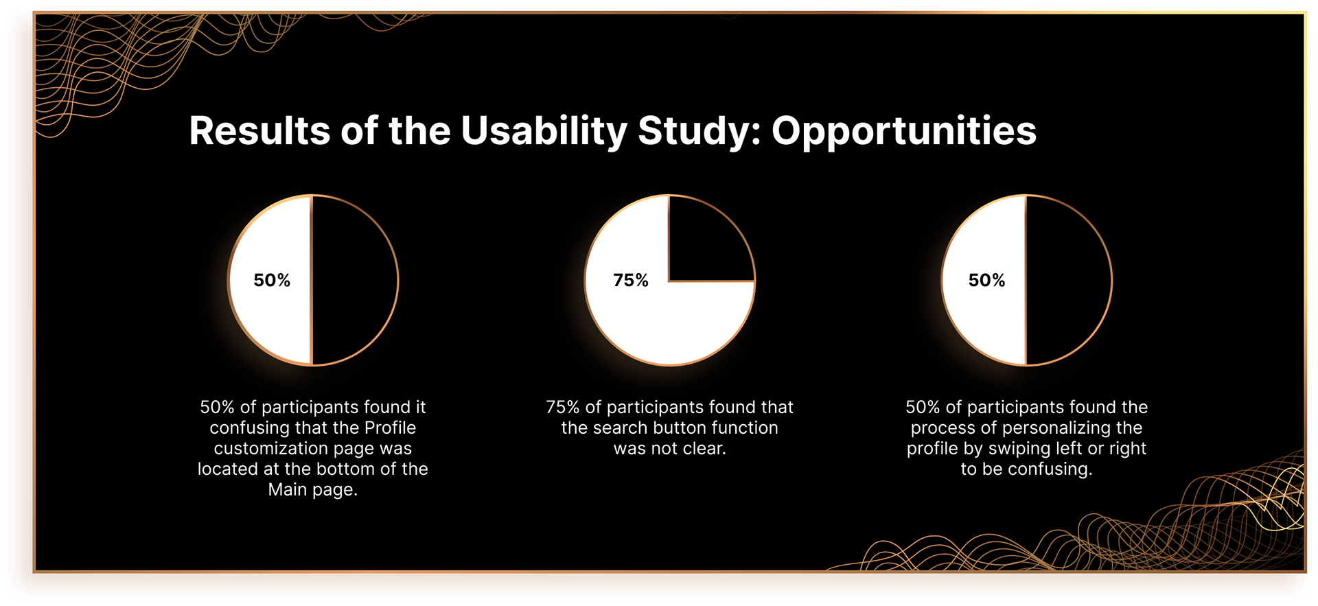
- 2 out of 4 participants found it confusing that the Profile customization page was located at the bottom of the Main page and not on the Menu above;
- 3 out of 4 participants found that the search button function was not clear;
- 2 out of 4 participants found the process of personalizing the profile by swiping left or right to be confusing;
- 1 out of 4 participants asked whether it is possible for the AI chatbot to behave like a tutor: not to give answers to the equations but to guide students by asking leading questions so that students can solve the math problem on their own.
Success
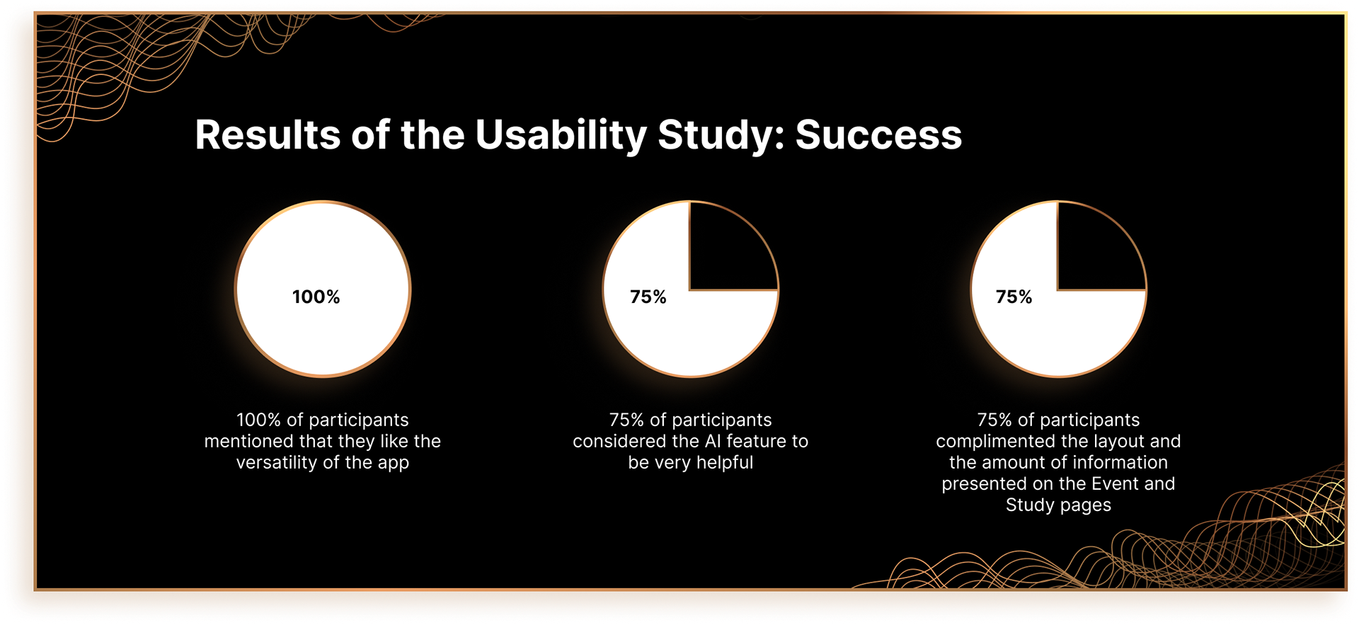
- 4 out of 4 participants mentioned that they like the versatility of the app;
- 3 out of 4 participants found the AI feature to be very helpful;
- 3 out of 4 participants were happy by the layout and the amount of information presented on the Event and Study pages.
- 3 out of 4 participants found the AI feature to be very helpful;
- 3 out of 4 participants were happy by the layout and the amount of information presented on the Event and Study pages.
Results of the Usability Study: Opportunities
Results of the Usability Study: Success
Insights and Recommendations
- To simplify the navigation process by adding back buttons to all screens of the prototype;
- To relocate the Profile personalization feature to the Profile page;
- To add signifiers to the Search button to improve users’ awareness so that they are using the AI-powered search;
- To add affordances to the swiping personalization process;
- To improve the AI-chatbot feature by allowing it to function as a personal tutor.
LET'S CONNECT!
Thank you for taking the time to review the RuBuddy project! If you would like to learn more about it or get in touch, feel free to contact me using the Contact Me form.

